Introduction
Imagine you are a business owner and have a company’s admin dashboard which shows common things like revenue, cumulative users and sales information about your business. As your business grows you gather more data and want insights on more details like where most of your users are located or a performance chart between paid and free users.
You proposed this idea to your analytics team and they said it will take around a week to analyze this data and then generate more charts but you wanted to showcase this data in one of the client meetings which is in the evening. So you end up having only basic insights about your business and you were not able to give more information about detailed sales analytics or business trend.
Now one day you needed some insights on users and sales to make an important business decision but that data was not available in the dashboard because you only have a traditional dashboard which shows static data and metrics.
Now you can’t tell your database managers to get all the related data from database and work with the analytics team to generate that single metric just for that single decision or task and spend multiple days on the task which can be done in minutes using Large Language Models(LLMs).
In this blog, I will discuss how we built a LLM tool which can dynamically generate dashboards using your business requirements and database.
We will discuss the following 👇
- The problem with traditional dashboards and how LLMs can solve it
- How we built the LLM query tool to generate dynamic dashboards and metrics
- Some business use cases of this tool
💡 You can get the full source code discussed in this blog from our github repository.
Why Dashboards Are Essential
Now since we are talking about dashboards then let’s first discuss why we need dashboards and does every business needs a dashboard?
So the simple answer is Yes.
Dashboards are like windows into your data. They take complex information and turn it into simple, easy-to-understand visuals that help you make better decisions. In today’s fast-paced world, where businesses rely on data to stay competitive, dashboards have become a must-have tool.
Think of a dashboard as a central hub where all of your data is organized in a manner that anyone can take a look at it and decide what is happening inside your application by looking at the charts. Dashboards are also very useful when you don’t have much time to go through different spreadsheets or your database and you quickly want some insights about your business then you can get it from your application’s admin dashboard.
Problems With Traditional Dashboards
The main problem with traditional dashboards is they are static and can show analytics only on limited data. Before creating your dashboard you need to decide which charts or metrics will be better for you that can help you make important decisions and goals for your business. To decide this, you need to consider your business market, clients and your future goal. Once you have decided all the metrics, you can then pass it to your technical team or analytical team to process the application data and then generate the dashboard.
Each organization consists of various roles and departments, so each role might have their own metrics requirements. For example, the sales team might want some deeper insights on each year’s revenue and sales to generate the sales report and at the same time marketing team might want insights on users and trends to keep up with competitors and new market trends. If you are managing this all in a single dashboard then it will be so hard for you to decide which metrics to add in your dashboard and it can make things harder for everyone to make decisions based such dashboards.
If you keep adding multiple charts and metrics for each department then your dashboard might look like this 👇
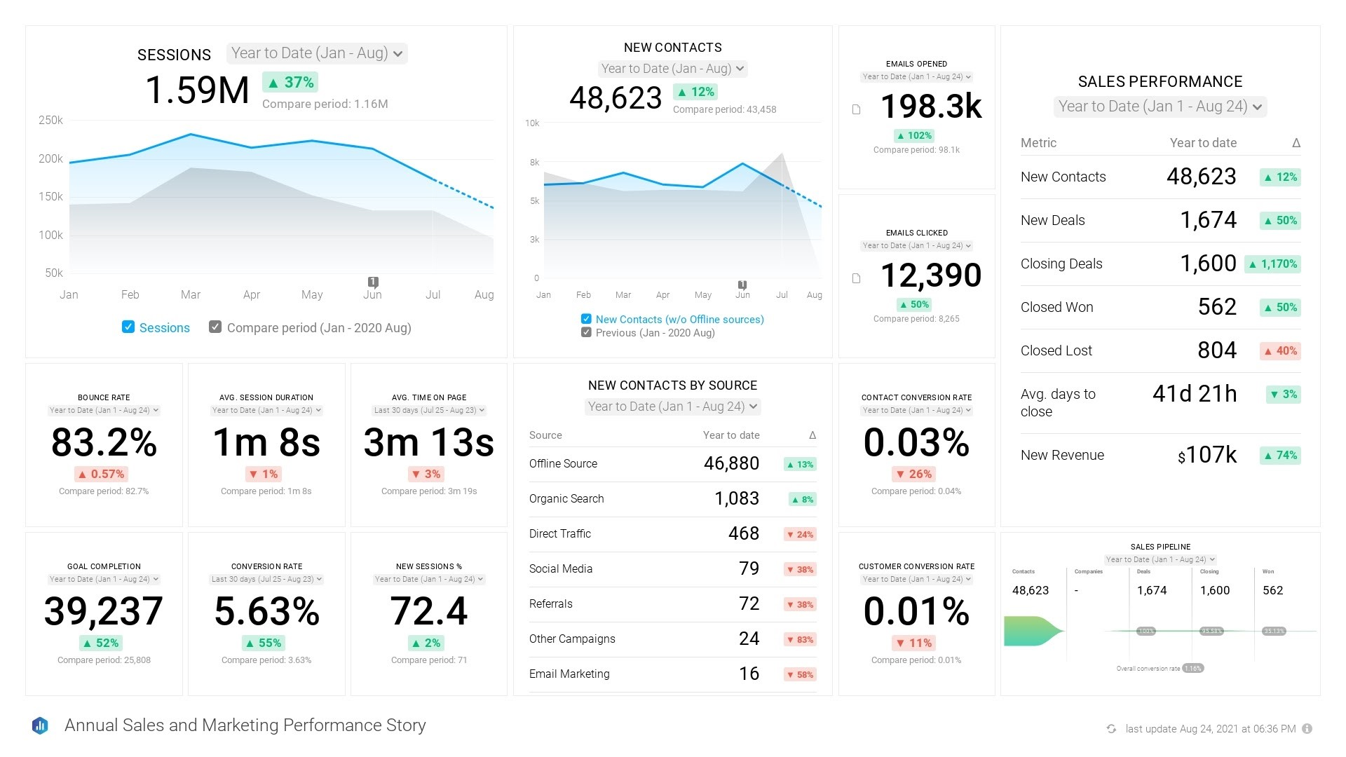
As you can see, the above chart is not readable at all and you can’t decide which metrics to look at and which one is more important to make your business decision.
Also as we discussed in above scenario, you might want some personalized information for a specific chart to make a business decision and it can take longer time to process and analyze the data according to the requirements.
How LLMs can help here?
LLMs allow you to interact with any database using a simple prompt or question and easily get the required data. Users can simply ask for what they need for example “Give me last month’s sales compared to the current month” and it will dynamically create charts and metrics for you.
There are several advantages of using an LLM to create dashboards 👇
- Understanding natural language queries: LLMs can understand user requests in plain language such as “Show me the sales trend for the last 6 months”
- Generating customized visualizations: LLMs can analyze your business requirements and generate only the required visuals and metrics
- There is no need to write complex queries: You can use LLMs as a query translator which can convert a plain text into database query without the need of an advanced database knowledge.
- Providing insights and recommendations: LLMs can not only just show the visuals but it can analyze and summarize the data at the same time so that you can get a summary of the whole chart or metric and make your decision more quickly.
- Enhanced Personalization: Anyone inside the organization can interact with LLM and only get the data they want without unwanted metrics and charts.
- Real-time data adaptation: LLMs can dynamically update dashboards based on the user requirements. If an user wants to add a new filter or metric then LLM can instantly fetch the filtered data from database and update the dashboard accordingly.
Making something like this sounds hard right? But it is not 👀!
What are We Building?
In this blog, we will create a tool that will analyze our database and business requirements and generate dynamic and personalized dashboards.
We will also add features like chart recommendation and data analysis as a bonus. I will also discuss the challenges that you might face while creating such tools and how to overcome them.
On top of that, we will create one streamlit application to show our dashboard that you can easily integrate inside your business. So let’s get started! 🚀
💡 You can get the full source code discussed in this blog from our github repository.
Prerequisites
Before starting this project, make sure you have the following 👇
- OpenAI api key (Generate one from OpenAI dashboard if you don’t have one)
- A database (It can be any database like MySQL, PostgreSQL, etc)
- Basic knowledge of Langchain and databases (If you want to learn about Langchain then you can take a look at my other blogs where i have explained it in detail)
Workflow
Here is the full workflow of our tool which we are going to build 👇

Here is the workflow of our tool 👇
- We will first take some information about user’s business and what they want to visualize in the dashboard and also we will take the database URL to connect with.
- After that, we will connect with user’s database and get some information about the database like database schema and table structure. Now that information will be passed to the chart ideas generator which will generate some chart ideas based on the business requirements and database. If the user already has defined any chart requirements then it will be considered otherwise it will generate ideas on its own.
- For each chart idea, we will generate the database query to get the related data from the database and execute that query using database query executor tool.
- Once we get the database response, we will pass it to the chart data generator tool that will format the database response according to the requirements of your chart along with more information like chart insights, chart information and a unique heading for your chart. At last, our streamlit application will combine all of these charts and create a proper dashboard.
If you are wondering where is LLM here then all of these tools will be using an LLM model under the hood which we will discuss further in the blog. So now you know the high-level workflow of our tool so let’s dive deeper into it 🚀!
Step-1: Generating personalized chart ideas for user’s dashboard
The main advantage of using LLMs is the personalization it provides in your applications. Anyone can mention what they want in plain text and LLM will do the rest of the work for you based on the information you have provided. We can leverage this power of LLMs here as well, we will first take some information about the database and what insights user wants from the database. If the user don’t have any idea about what metrics could be more helpful for the given business and database then LLM will automatically generate these chart ideas by itself.
We will generate total 3 charts for now but you can generate as many as you want for your use case.
Getting database information from URL
Now the first question which may come to your mind is “How can we connect our LLM with database? 🤔” or “How does LLM knows about my database structure or schema? 🤔“ because we only have provided the database URL. So we will be using SQLDatabase Toolkit from langchain which allows us to connect an LLM model with sqlalchemy (used for database connection in python) database session.
So let’s start by installing the required packages and dependencies, I will suggest you to create a new conda environment and install the dependencies there to avoid any dependency conflicts.
First of all, let’s add our openai key as an environment variable so that we can use it in our LLM models. I am going to use “gpt-4o” model here but you can use other models as well.
Now let’s make a function which will take database URL as a parameter, create a database engine with given URL and connect it with SQLDatabase Toolkit.
I have a PostgreSQL database which contains some user and their payment information and i am going to use this remotely hosted database for testing. Here is the database schema of my database 👇
Now you can easily get information about your database using SQLDatabase Tookit using “get_table_info()” method which looks like this 👇
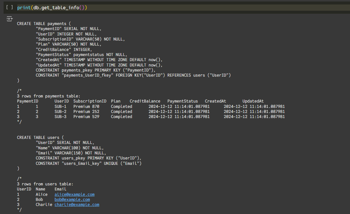
As we can see, it gives us the database schema along with some sample row data which can be given as a context to our Large language model. Now let’s see how we can use this table information to generate some chart ideas based on the user’s business requirements.
Generating Chart Ideas
Once we get the table info, we can pass it to our LLM prompt so that it can be used as a context to generate chart ideas. We will get the business information and table information and pass it to the chart ideas generator. It will generate 3 unique chart ideas in the form of array of JSON objects where each object will contain the following information 👇
- Question: This will be a 25-30 words prompt which will be passed to the query generator to generate a query
- Info: Some information about the chart which are going to be generated so that we can show this info to user and user can decide whether they want to generate it or not.
- Type: It will show the chart type. In this blog, we will only allow Line chart, Area chart and Bar chart for our dashboard but feel free to generate other charts as well.
Here is the prompt which i am going to use to generate chart ideas 👇
Now let’s initialize our llm model as well.
Finally, let’s wrap it inside an LLM call and format the LLM response with “json.loads()” function to make sure that we are getting a valid JSON data.
After running the above function, it will give you 3 unique chart ideas along with other information based on your database info and business info 🤩!
Step-2: Extracting Database Information
Now it’s time to gather the required data to generate the charts from chart ideas so we will create a tool that will take the prompt generated by chart idea generator tool to generate a database query. We need to make sure that this tool generates programmatically correct query for a given SQL database and then this query will be passed to the query execution tool to get the data.
Generating Database Query
Now in this tool, we need to add more validation as working with databases is a crucial step and we don’t want to execute any invalid query that might affect our database or application so we will use a SQL query generation prompt created by langchain which you can get it from hugging face.
The prompt looks like this
I added some more instructions in this prompt to make it work with PostgreSQL database.
We also need to add a strict type checking on LLM output because we want a valid query that will be passed to our query execution tool. You can specify the expected output structure using “with_structured_output()” method in your LLM.
Here is the query output structure 👇
It is a good practice to also add a query verification tool as an extra step to validate the query
Now let’s combine everything and create a function that will use the new prompt along with structured LLM.
Executing Database Query
Now it’s time to execute the query generated by query generator. Fortunately, SQLDatabase Toolkit also provides a tool to execute database query using sqlalchemy database engine. We will use “QuerySQLDataBaseTool” to execute the query. Let’s create a function which takes a database query and URL and executes a given query
And now we can successfully generate and execute database queries on the database 🚀!
Step-3 Generating The Dashboard
So now we can interact with the database using plain text through our LLM but to generate a metric or chart we need to properly format this database response according to the chart library we are using.
In this dashboard, I am going to use streamlit charts which allows us to create different charts like line chart, bar chart and area chart using pandas dataframe. We will create a chart data generator tool to convert the database response into pandas dataframe.
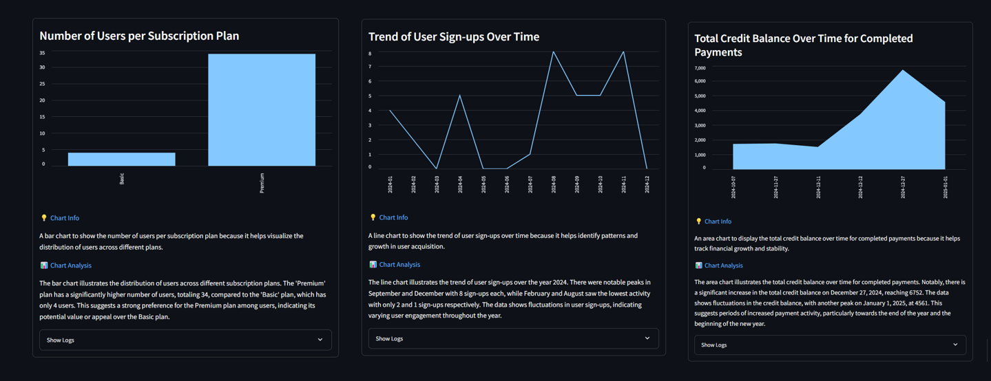
The dashboard will look like this 👇
Formatting Database Results
We will create one tool that will take the database response along with some other information and format the database response to generate a given chart. We will pass this information to our LLM and the LLM response will contain the following fields 👇
- Title: A relatable title for our chart or metric
- Columns: It will be an array of strings where each element describes the name of the column in pandas dataframe. In other words, if a line chart have 3 different lines then each element in this array will show the name of that line. In most cases there will be a single element in this array.
- Y axis data: It will be a 2D array where each nested array will store the Y axis values for each column. There might be more than one column in a chart that’s why we are returning this data as a 2D array so that we can get chart data for each column at once. We need to make sure that each nested array have same length and we can put 0 to place empty values.
- X axis data: It will be an array which will show the X axis fields for the chart. The length of this array must be same as length of each nested array in Y axis data array.
- Chart type: The type of chart (Line chart, Bar chart or Area chart)
- Insights: Some analysis of the database and chart data which we are going to show below each chart.
Let’s see the code for the tool
Now we just need to plot this chart data on streamlit charts 📈!
Generating Charts
Let’s create a python function to generate a chart with the given data based on the chart type. It will take the JSON response from chart data generator tool and generate streamlit charts.
We also need to handle some edge cases like:
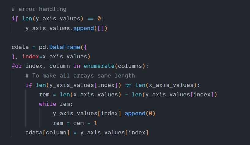
- If there is no element in y_axis_values array then add an empty array to show no chart data in dashboard
- If the length of y_axis_values and x_axis_values data is different then add 0 at the end to show empty values.
The above 2 cases will happen rarely but it is a good practice to have a error handling for LLM response because we haven’t added any strict structured output from our LLM just like we did in query generator.
And we have successfully created all the tools needed for the dynamic dashboard. Finally, let’s create a streamlit application around it to make it look more interactive!
Step-4: Integrating Streamlit Application
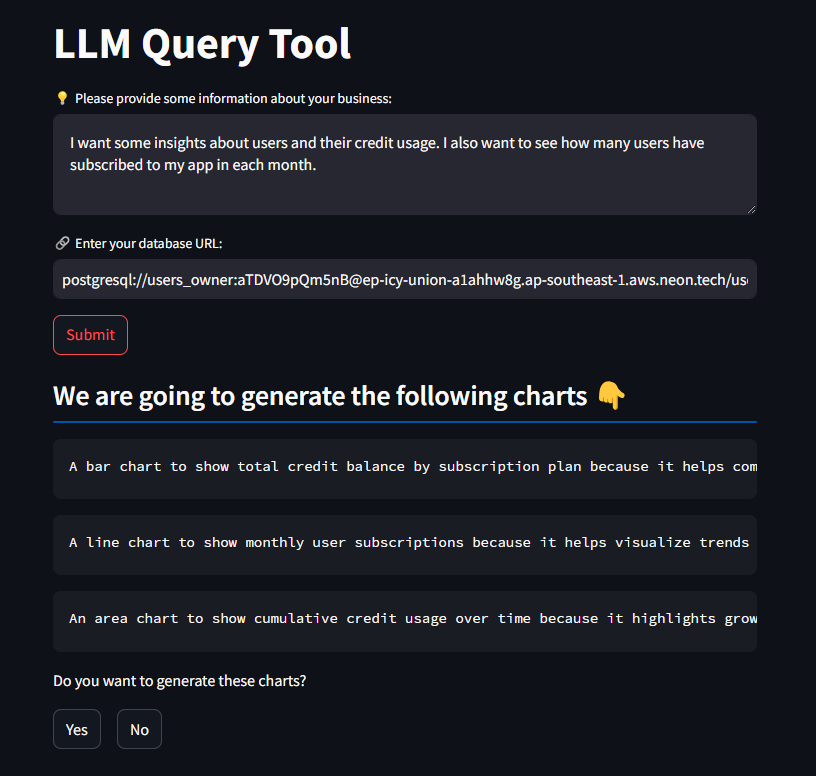
Lastly, let’s wrap everything we created with a streamlit UI to see an actual dashboard. We will first take some information from the user and then show them the chart ideas which we are going to generate. The user will select either “Yes” or “No” to generate those charts and then the dashboard will be generated. Feel free to add more information in the streamlit UI and prompt according to your needs.
Taking User Input
As we discussed in the beginning, we are going to take some business information and a database URL from the user but you can take more information according to your needs. Let’s create 2 text boxes to get this info:
Once user clicks on the “submit” button, we will connect with the database URL and generate the chart ideas based on the table info and business info.
Generating Ideas
Once we get the information from the user, We will then get the database information using SQLDatabaseToolkit as we discussed above and then pass it to the chart ideas generator tool. We will then show the chart ideas to the user and ask for their confirmation.
You can also add a edit button to allow users to edit any idea before proceeding
It will look like this 👇
Generating The Dashboard
If user clicks “yes” then we will loop through the chart ideas array and pass each question to our query generator tool. Query generator will then pass the database query to query executor and then the database response will be passed to chart data generator tool.
At last, we will loop through the chart data of each chart and show the following things in card 👇
- Chart Heading: A title for our chart
- Chart: The actual chart
- Insights: Some insights about the chart based on business info and chart info
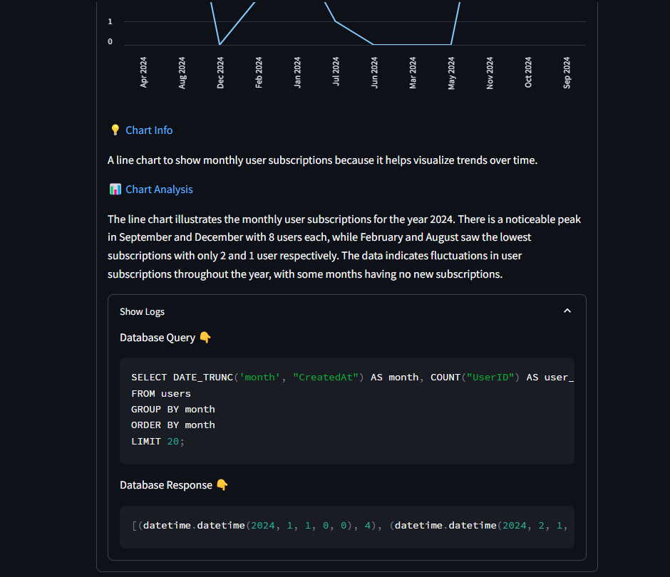
- Logs: Logs to show the database query and database response used to generate the chart.
After running the streamlit application, You will see the dynamic charts generated by LLM based on your business info and database 🚀!
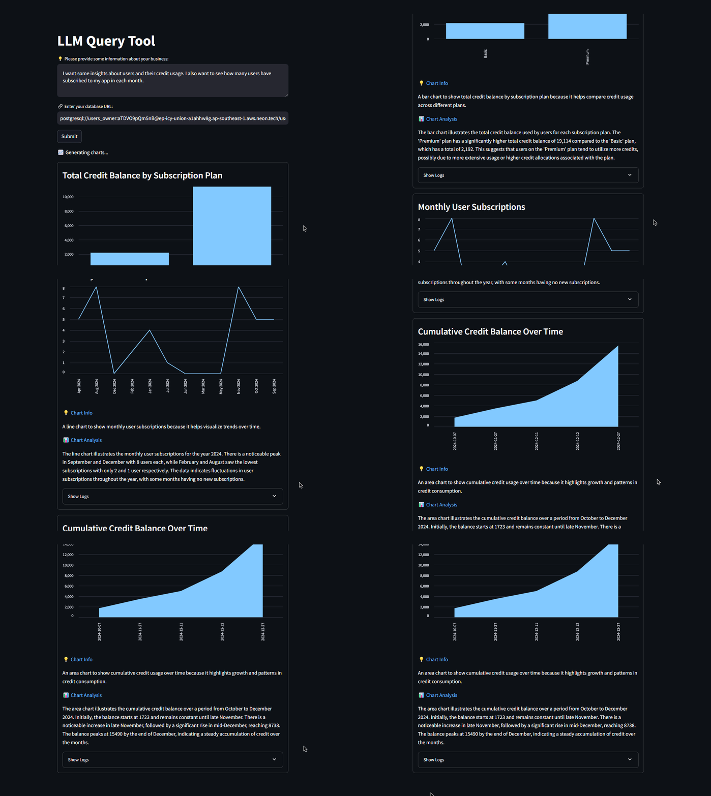
You can also click on “Show Logs” to see the database query it used to get the data
And we have successfully created the LLM query tool which can dynamically generate metrics and charts based on your business requirements 🎉!
💡 You can get the full source code discussed in this blog from our github repository.
Business Use Case
We used this tool with our internal databases and also connected it with our client’s project database. We noticed that the tool was able to properly analyze the database along with the given business info. It also generated the charts and insights which we should have considered inside our traditional admin dashboard.
It also generated separate insights for each metric which could have taken 2-3 days just to analyze the chart data but it did it in 2-3 minutes 👀!
Take a look at below table to get more info about how much time this tool saved for our use case 👇

As you can see above, It saves a lot of time and money to generate charts and insights for a given project. Also you might need to delegate each task to a separate team (for example, database team to generate queries, tech team to generate charts, analysis team to generate insights) but this tool can do all this by itself.
Challenges
So now let’s discuss the challenges i faced while creating this tool which you might face too and how to solve them.
The most important thing in this tool is the database data and we need to extremely cautious while working with databases because a single query can manipulate all of your data so my main focus was on the database query which is getting generated and also making sure that i am getting results in a expected format from LLM. So let’s discuss these both in detail.
Query Validation
Whenever you are working with databases using LLMs then you always need to verify the query before executing it. Here, I was making sure that i am getting correct query by using structured LLM output and detailed prompt. The latest LLM models are smart enough to generate a valid query but It is still recommended to use a query validator tool or LLM which will take your database query and information and tell if it’s valid or not before executing it.

Also you need to make sure that if your query fails then you need to regenerate the chart using new query or hide that chart from your dashboard.
In this tool, we are only reading a data from the database so we don’t need to generate or execute any update or delete query. I explicitly mentioned this in the query generator prompt to make sure that we don’t manipulate the database data.
Handle Randomness of LLM
When i was making the tool, Sometimes i was not getting the correct query sometimes and it was happening for only 5% of the time for the same prompt because of the random nature of LLMs. To avoid this, i lowered the temperature of LLM to lower the randomness and then it started generating correct query each time.

Manually Validating LLM Results
As we are talking about the randomness of LLMs, let’s talk about validating the LLM response. So in chart ideas generator and chart data generator tools i was expecting the response in specific format as you might have seen above, but i was not using structured LLM response which i was using for query generator. So it is recommended to use the structured output for these 2 tools as well.
I also added a manual check for LLM response of chart data generator to make sure that i am getting valid chart data. I was making sure that i am getting same elements in both y axis and x axis data and if there is no data then i am showing a blank chart instead of an error. If there is no data available for any field, then i was adding 0 there to make them the same length. Both of these edge cases will be handled by LLM itself but it is a good practice to have a manual check in your tool.
Conclusion
So whether you are a small startup or a large business, You will always need a dashboard which you can refer to track different organization metrics. And what could be better than having your own personalized dashboard which can generate all the charts and metrics dynamically without a need of manual analysis and database expertise that can save you a lot of time and money.
As we saw in the blog, It is very easy to generate such tool using Langchain and LLMs. You just need to handle some edge cases and you can easily integrate this tool in your organization which will help you and your team to work with your database and perform analysis with the power of AI.
Want to Automate any Workflow?
If you are looking to make something like this or have a workflow which should be automated then feel free to book a call with us and we will be more than happy to make your ideas into reality and help your business grow using AI.
Thanks for reading 😄


.png)

